
navigation app for the visually impaired
Design Challenge: As part of a human factors engineering class, my task was to design a smartphone-based application that allows visually impaired users to navigate to a destination.
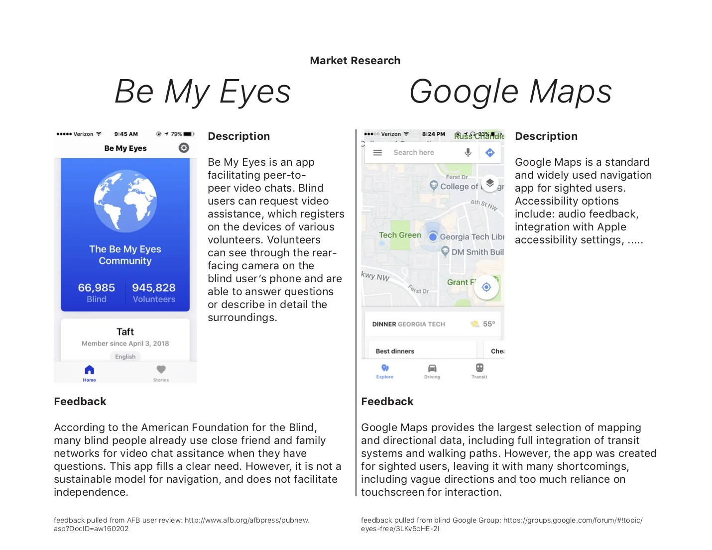
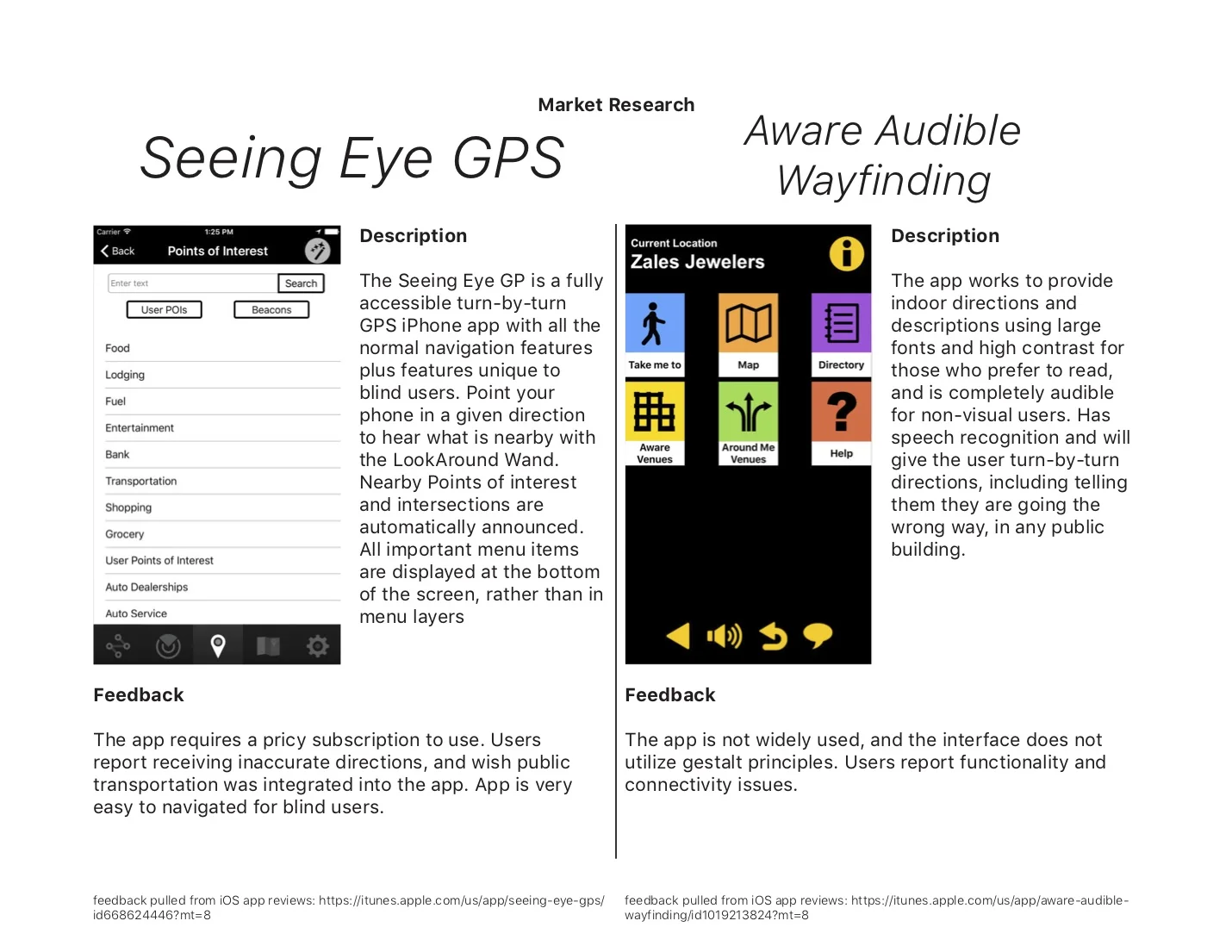
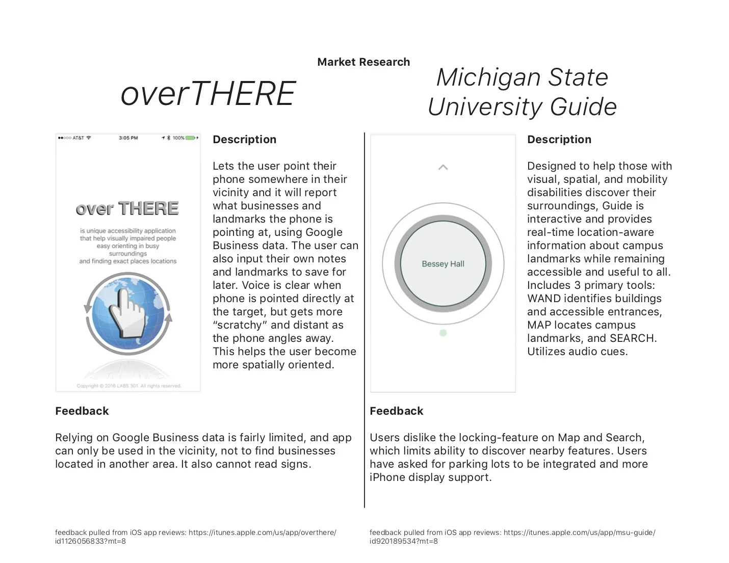
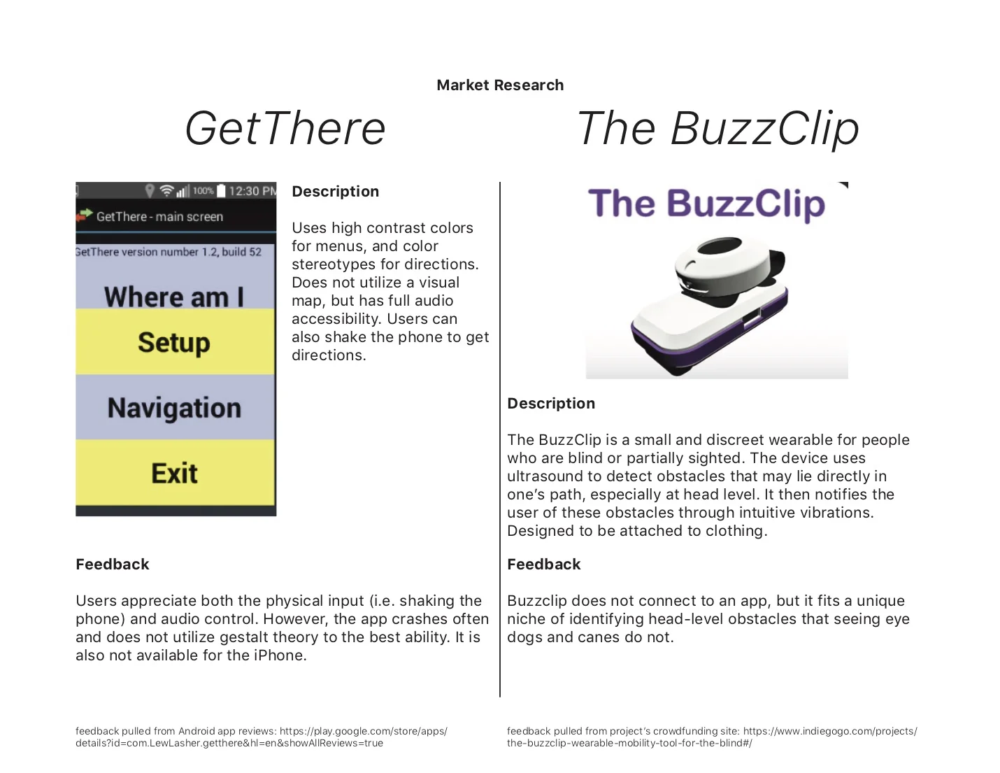
phase one: analysis of existing applications
phase two: user experience research
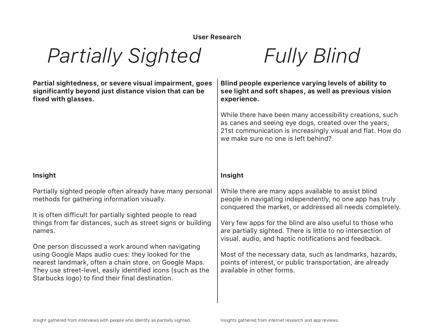
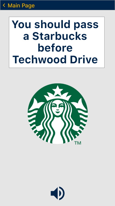
Some of the common problems that were encountered upon using various way-finding apps were the lack of detailed instructions when navigating across streets and identifying small obstacles that are not recognized by Google Maps. This was tested by using commonly used navigation applications such as Google Maps, with the user’s eyes closed. A legally blind person was also interviewed. While this person requires audio directions from Google Maps as he cannot read street signs, he is able to view general shapes, allowing him to navigate around obstacles. He uses recognizable landmarks such as the Starbucks logo to find his final destination. In order to read the screen of his phone, he must hold his phone close to his face.
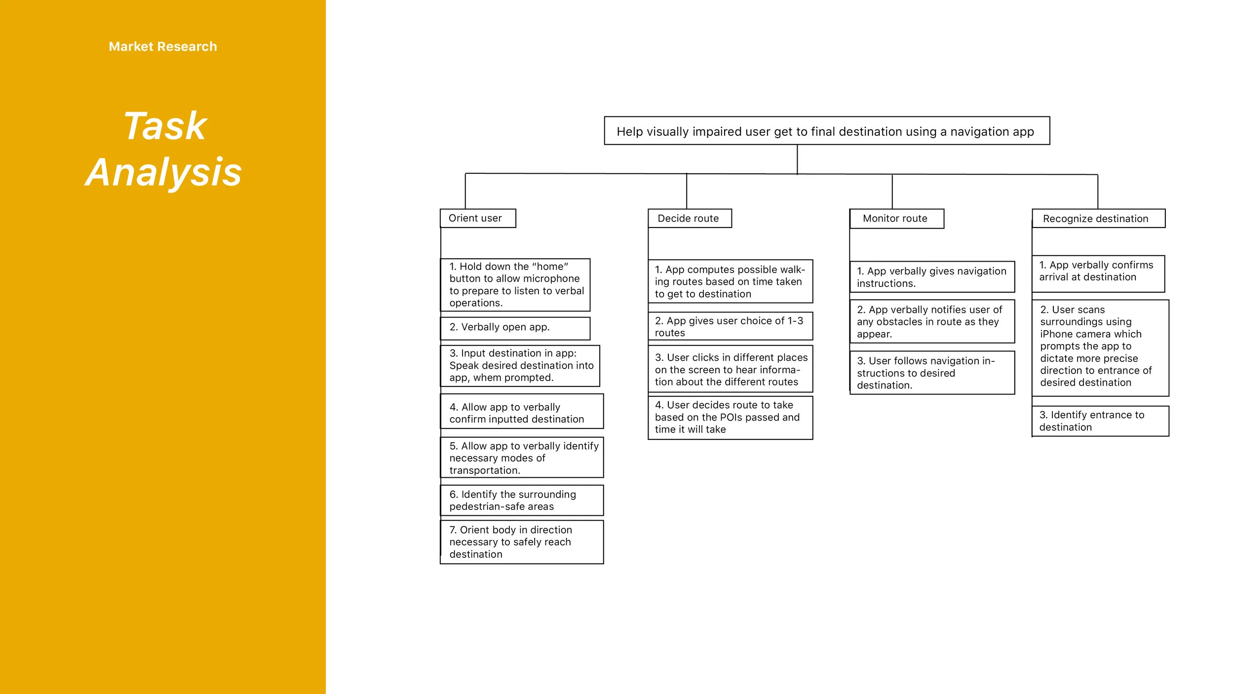
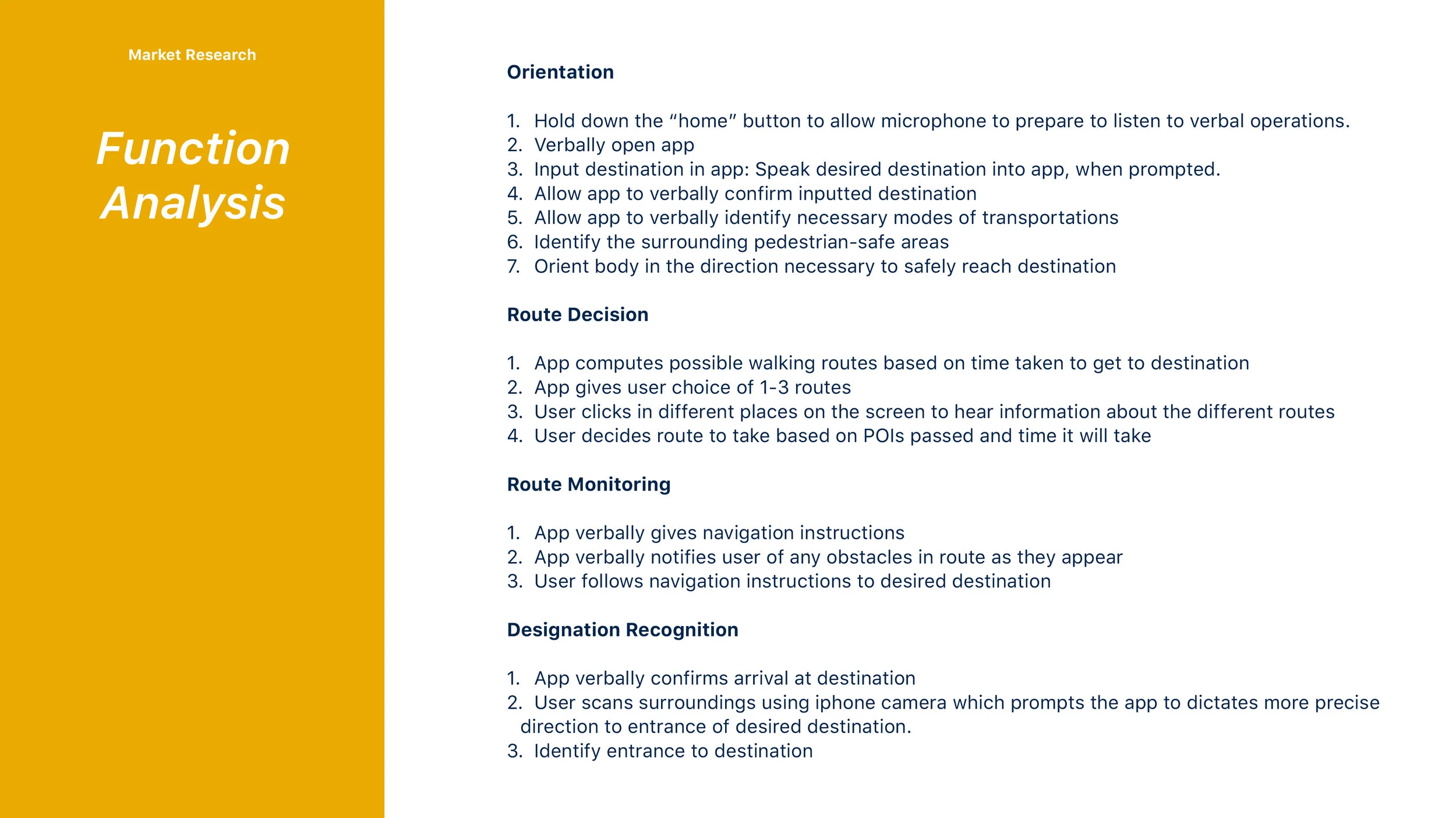
phase three: task & function analysis
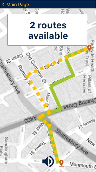
proposed solution
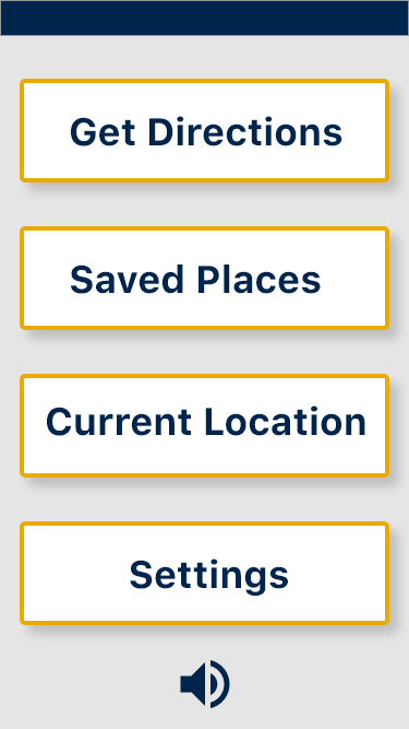
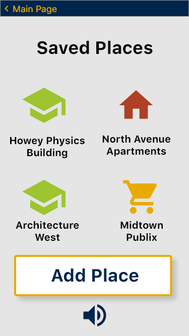
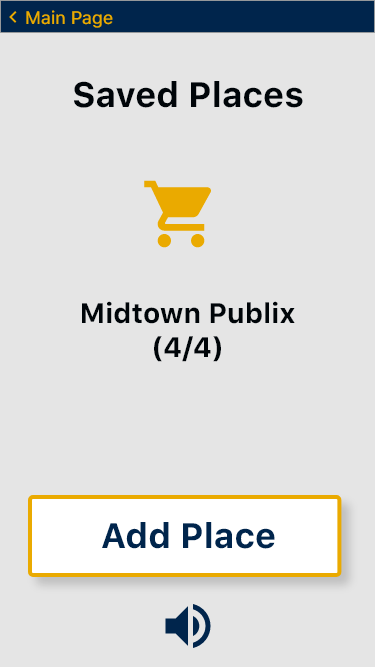
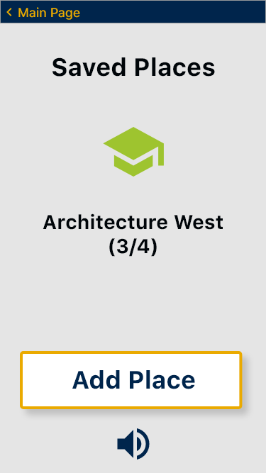
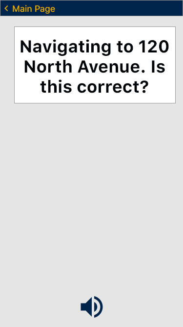
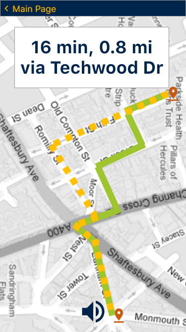
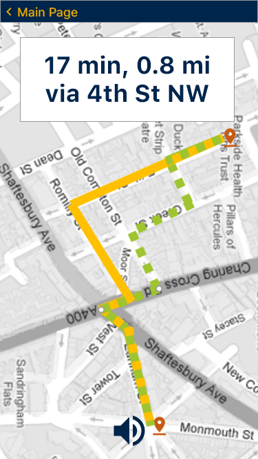
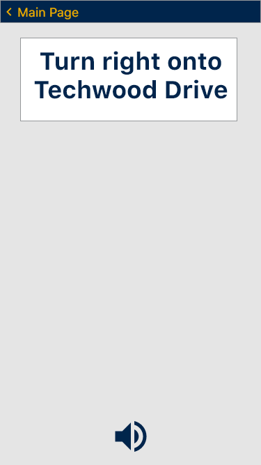
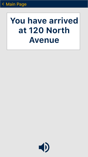
Using the built-in iOS navigation platform, Apple Maps, there is no catch to ensure that the visually impaired or blind user is in fact navigating to the correct location. Therefore, our proposed solution uses location pins, a destination confirmation screen before the user can continue to navigation, and tells the user about things they may pass on the way and what their destination is close to. Our app has built-in screen read-overs with customizable read-over settings. A user can also turn off the read-overs and opt to use the iOS accessibility settings instead. Our app also specifically uses a color palette containing bold colors against bland backgrounds, for ease of visibility for the visually impaired. The color palette was also specifically designed to use different shades of colors, so that even if a user is color-blind, they will still be able to distinguish between different buttons. The pined locations section of our app uses color-coded icons to help the visually impaired user distinguish between the different types of places on their pinned list (ie a green graduation cap icon for academic buildings, or a yellow shopping cart for grocery store pins).

phase four: user testing
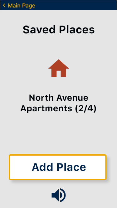
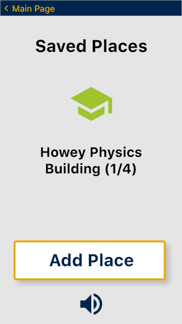
User testing was performed using app mockups on notecards and simulating the steps from opening the app to confirming the final destination with a visually impaired user. Feedback included appreciation for the inclusion of potential obstacles on the route as well as the ability to utilize haptic touch. The recognition of this was important as feedback on existing applications included specific directions but for a wide range of locations. The advance notice of obstacles such as pedestrian crosswalks and staircases was important as it was a feature that was missing in other existing applications. The user interface design of the application included a color palette that provides high contrast, allowing user’s to distinguish between different parts of the screen. Testing showed that this color palette work as intended, however, some of the icons, such as the education or grocery icons, were hard to distinguish for some levels of visual impairment. Feedback showed that inability to distinguish those icons did not affect the overall usability of the application.
human factors considerations:
Our app uses the principles of consistency and standards throughout each screen. In each screen, the back button is the same color and in the same place for ease of use for both the visually impaired and blind. It is in the top left corner, which is the same place all official iOS apps have their back buttons. A corner of the phone screen is also an easy place for a blind person to feel out and navigate. However, making the back button consistent with all other iOS apps was also a trade off, because it is often a very small ‘<’ arrow with words describing the page it will go back to, making it hard for a visually impaired person to make it out (let alone read it), and a blind person to click the exact right spot. Therefore, we settled on putting it in the same place as other iOS apps, but changing the color from standard Apple blue, to an yellow that we researched would always be decipherable against the navy blue background in case of color blindness.
By providing the user with the ability to pin frequently visited locations, our app implements the principles of flexibility and efficiency of use. Although many users of current navigation apps for the visually impaired really liked or wanted a feature like this, it was a trade off because it made the homescreen of the app more complicated by adding another button. It also takes away from the streamlined usage of the app, as there are extra steps, and therefore extra buttons the user must navigate to in order to pin a location. However, this inclusion of pinned locations ultimately leads to a more effective interface because it lets users more quickly navigate to places they have saved, rather than having to remember an address in working memory.
Our app tells users points of interest (POIs) that they will pass on the way to their destination. This helps visually impaired users, most notably one that we interviewed, reaffirm that they are on the correct path because they can check for the landmarks they are supposed to pass. For blind users, this function serves merely to point out places of interest that they may want to stop at on the way to their destination, which they would have no other way of knowing was there. These POIs employ the human factors principles of error prevention, recognition, and recovery, by helping the user recognize errors if they do not pass the stated landmark.
The human factors principles of simplicity and aesthetic integrity are used in the pinned locations screen. Aesthetic integrity is implemented by using Google Material Design user-tested icons, and color-coding them for the visually impaired user to better make out. Simplicity is used by also adding the building title underneath each logo, so that the user doesn’t need to rely on color and logo alone, which could lead to an overload of working memory to recall which logo/color combination pertains to which pinned location.
All of the app pages use the principle of simplicity by having the minimum required amount of information necessary to convey the needed information to the user. No superfluous design was used, and this app is on the plainer side for ease of use so the user can use the principle of “see and touch” (or it’s equivalent), rather than “remember and type”, as one would have to do with a complicated interface. This is a tradeoff however, as the app may be perceived as “ugly” by sighted viewers or users due to its simplicity. However, this tradeoff was deemed okay because the target user group is not sighted people.
summary:
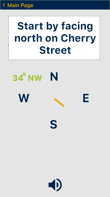
- haptic feedback generated by the taptic engine
- i.e. compass buzzes when pointed in the correct direction so that the user does not have to turn their body.
- swiping doesn't require precision
- "points of interest" employ human factors principles of error prevention, recognition and recovery.