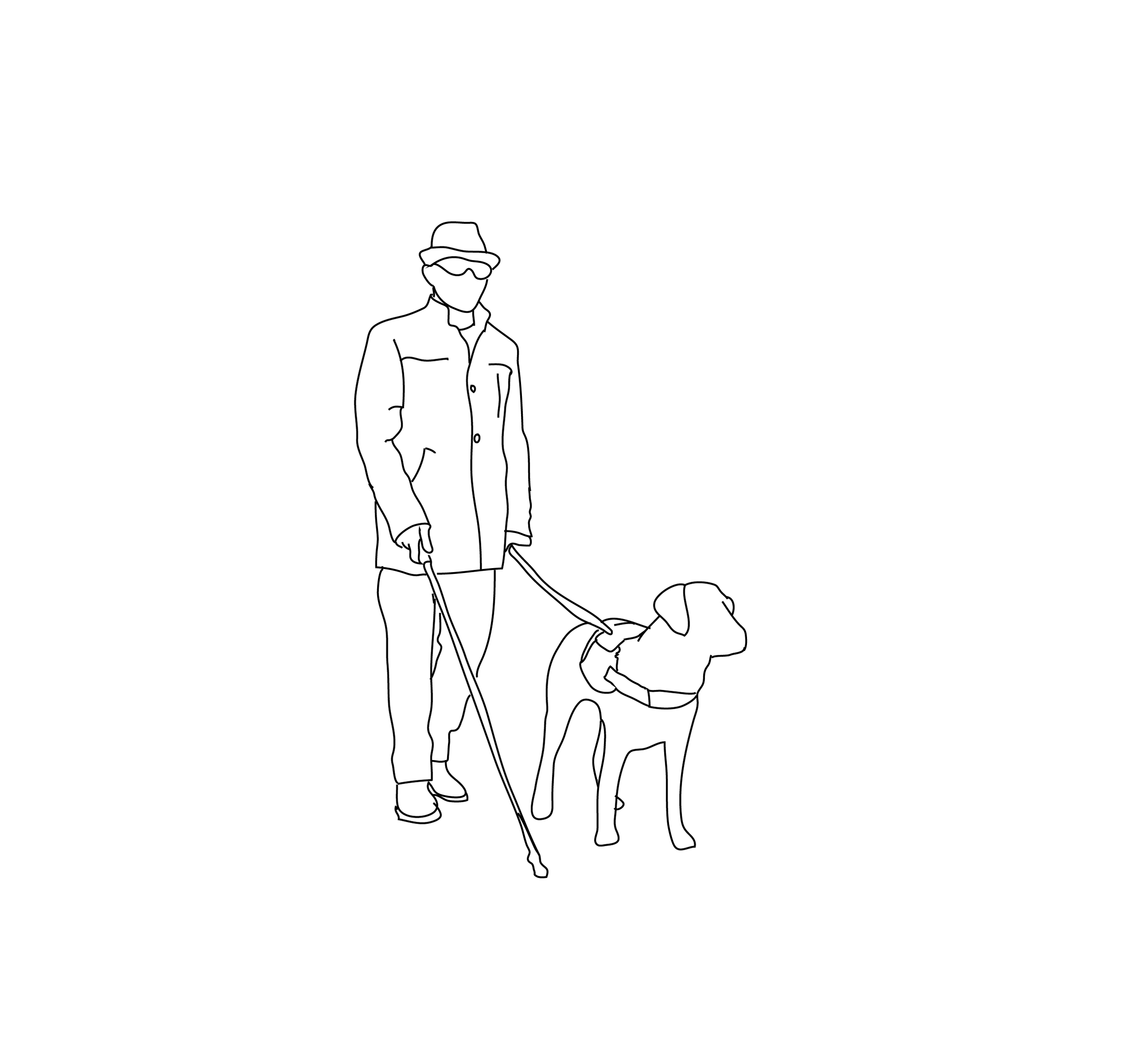
WAYFINDING FOR THE VISUALLY IMPAIRED
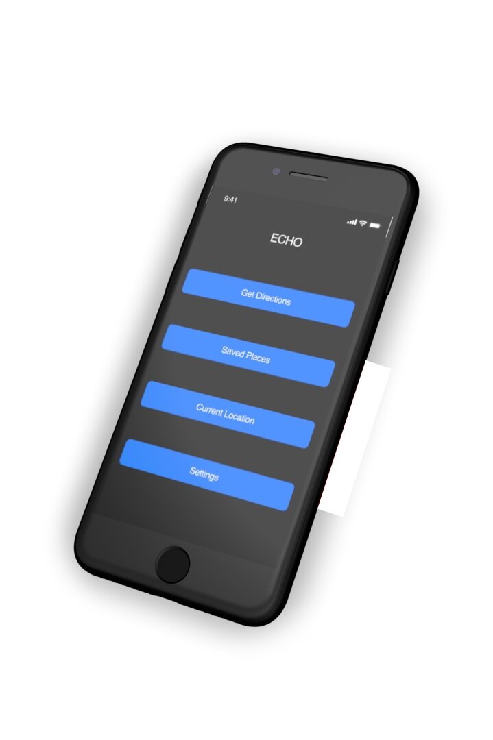
Echo
Navigation app for the visually impaired.
PROJECT TYPE
Human-Factors Engineering
Goal: Design a smartphone-based application that allows visually impaired users to navigate to their desired destination.
TEAM
Samira, Alexandra, Taft, Alissa
DURATION
9 Weeks
RESPONSIBILITIES
Competitive Analysis
Create function & task analysis
User Journey
Wireframes in Adobe XD
Solution: Haptic sense (touch communication through buzzes) paired with voice recognition and a contrasting color scheme allows users to receive confirmation regarding location, speech and direction.
Phase 1: Analysis of existing smartphone applications.
Be My Eyes
Blind users can request video assistance, which registers on the devices of various volunteers. Volunteers can see through the rear-facing camera on the blind user’s phone and are able to answer questions or describe the surroundings in detail.
Feedback:
According to the American Foundation for the Blind, many blind people already use close friend and family networks for video chat assistance when they have questions. This app fills a clear need. However, it is not a sustainable model for navigation because it does not allow users to operate autonomously.
Google Maps
A standard and widely used navigation app for sighted users. Accessibility options include: audio feedback and integration with Apple accessibility settings.
Feedback:
Google Maps provides the largest selection of mapping and directional data, including full integration of transit systems and walking paths. However, the app was created for sighted users, leaving it with many shortcomings, including vague directions and too much reliance on touchscreen for interaction.
Seeing Eye GPS
A fully accessible turn-by-turn GPS iPhone app with all the normal navigation features plus features unique to blind users. Point your phone in a given direction to hear what is nearby. Nearby points of interest and intersections are automatically announced. All important menu items are displayed at the bottom of the screen, rather than in menu layers.
Feedback:
App requires a pricy subscription to user. Users report receiving inaccurate directions and wish public transportation was integrated into the app.
Aware Audible Wayfinding
Works to provide directions and descriptions using large fonts and high contrast for those who prefer to read, and this is completely audible for non-visual users. Has speech recognition and will give the user turn-by-turn directions, including telling them they are going the wrong way in any public building.
Feedback:
The app is not widely used and the interface does not use gestalt principles. Users report functionality and connectivity issues.
overTHERE
Lets the user point their phone somewhere in the vicinity and it will report what businesses and landmarks the phone is pointing at, using Google Business Data. The user can also input their own notes and landmarks to save for later. Voice is clear when phone is pointed directly at target but gets more “scratchy” and distant as phone angles away. This helps the user become more spatially oriented.
Feedback:
Relying on Google Business data is fairly limited and app can only be used in the vicinity, not to find businesses located in another area. It also cannot read signs.
phase 2: user experience research
Some of the common problems that were encountered upon using various way-finding apps were the lack of detailed instructions when navigating across streets and identifying small obstacles that are not recognized by Google Maps. This was tested by using commonly used navigation applications such as Google Maps, with the user’s eyes closed.
Trevor Allen - Legally Blind
• Uses audio directions from Google Maps.
• Cannot read street signs but can view general shapes.
• Uses recognizable landmarks (e.g. Starbucks logo) to find final destination.
• Must hold phone close to face to read the screen.
phase 3: task analysis
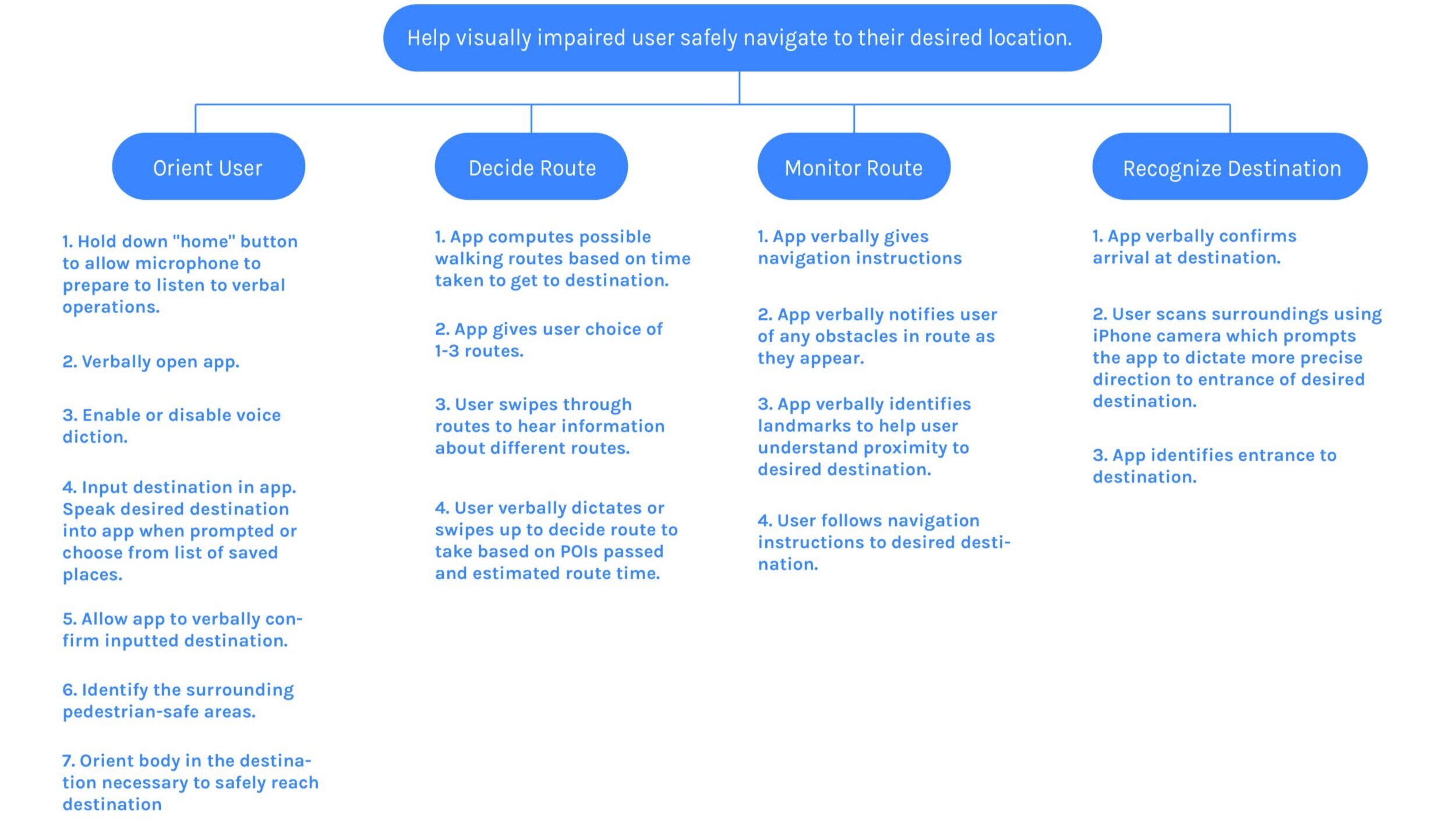
phase 3: Function analysis
Orientation
1. Hold down “home” button to allow microphone to prepare to listen to verbal operations.
2. Verbally open app.
3. Input destination in app. Speak desired destination into app when prompted.
4. Allow app to verbally confirm inputted destination.
5. Allow app to verbally identify necessary modes of transportation.
6. Identify the surrounding pedestrian-safe areas.
7. Orient body in the direction necessary to safely reach destination.
Route Decision
1. App computes possible walking routes based on time taken to get to destination.
2. App gives user choice of 1-3 routes.
3. User swipes through routes to hear information about different routes.
4. User verbally decides or swipes up to decide route to take based on POIs passed and time it will take.
Route Monitoring
1. App verbally gives navigation instructions
2. App verbally notifies user of any obstacles in route as they appear.
3. User follows navigation instructions to desired destination.
Destination Recognition
1. App verbally confirms arrival at destination
2. User scans surroundings using iPhone camera which prompts the app to dictate more precise direction to entrance of desired destination.
3. App identifies entrance to destination.
proposed solution
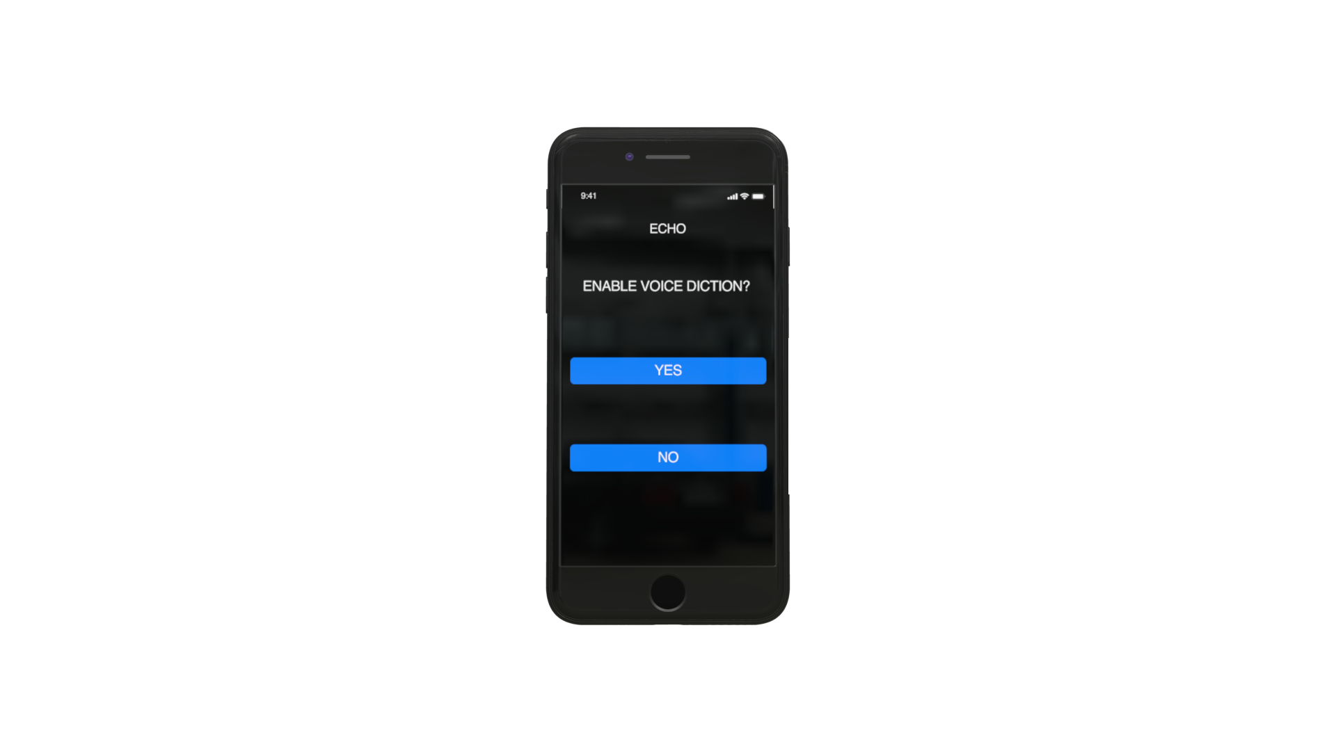
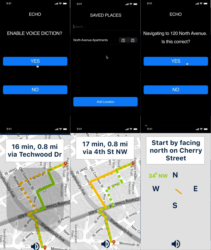
Completely blind users can say “yes” to choose voice diction. Those with visual impairments can choose “no” if the high contrast colors are strong enough to read.
ECHO: “Would you like to enable voice diction? Press and hold screen while saying either ‘yes’ to enable voice diction or ‘no’ to continue with high contrast screens. Please allow device to buzz before speaking.”USER: “Yes.”
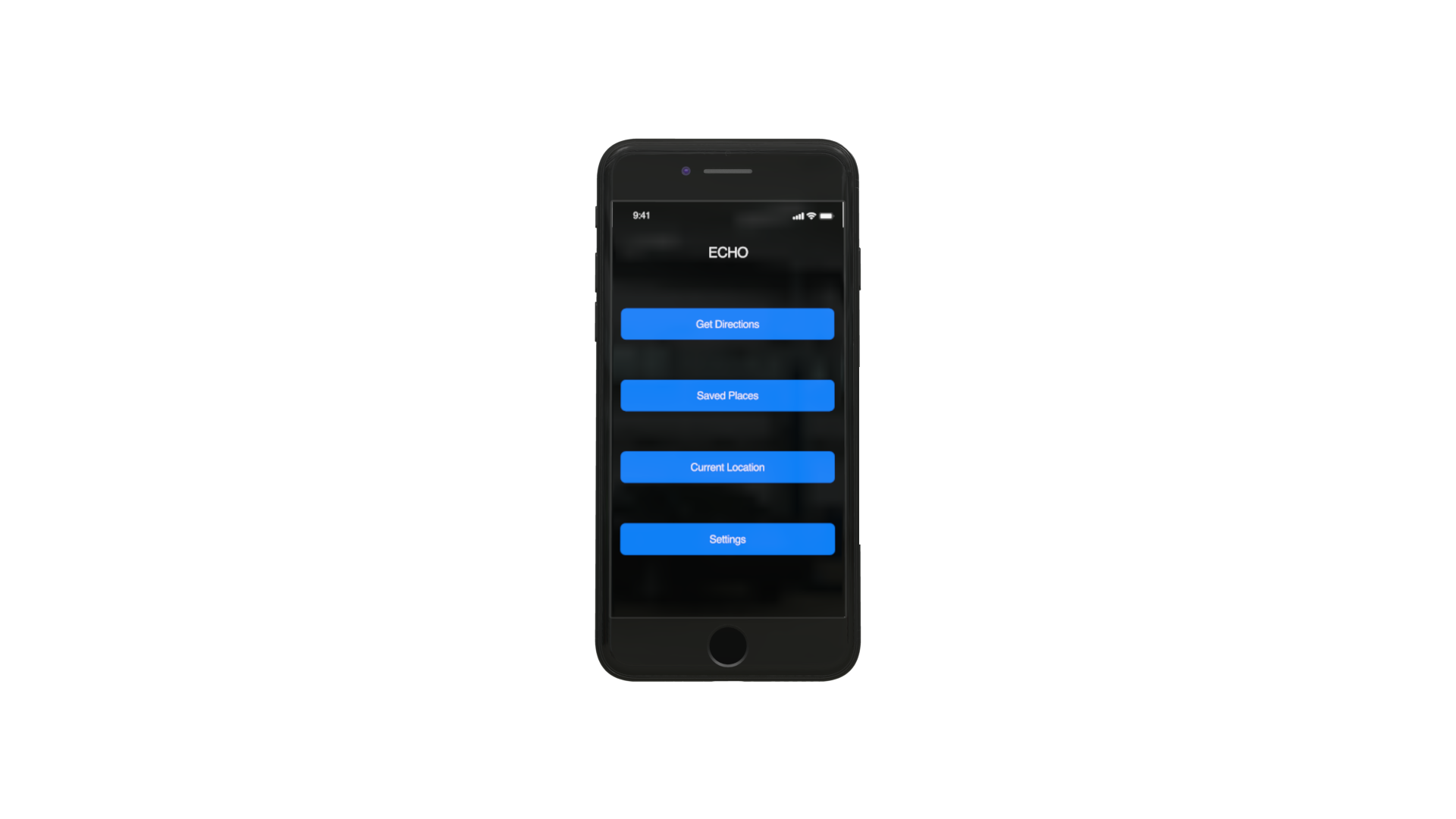
ECHO: "Homepage. Repeat option you wish to choose. Get Directions. Saved Places. Current Location. Settings."USER: “Saved Places.”
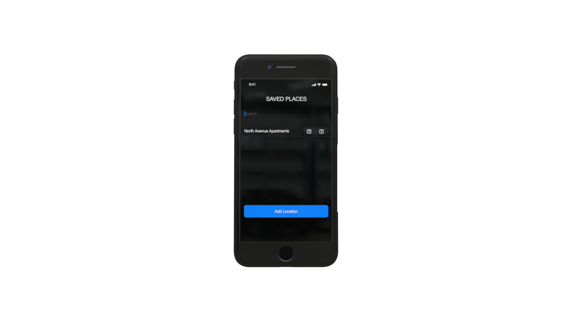
Users can quickly navigate to saved locations. Users can hold down screen with finger while dictating their desired location. Haptic touch enables users to know when device is listening through short buzzes, signifying when they can start speaking.
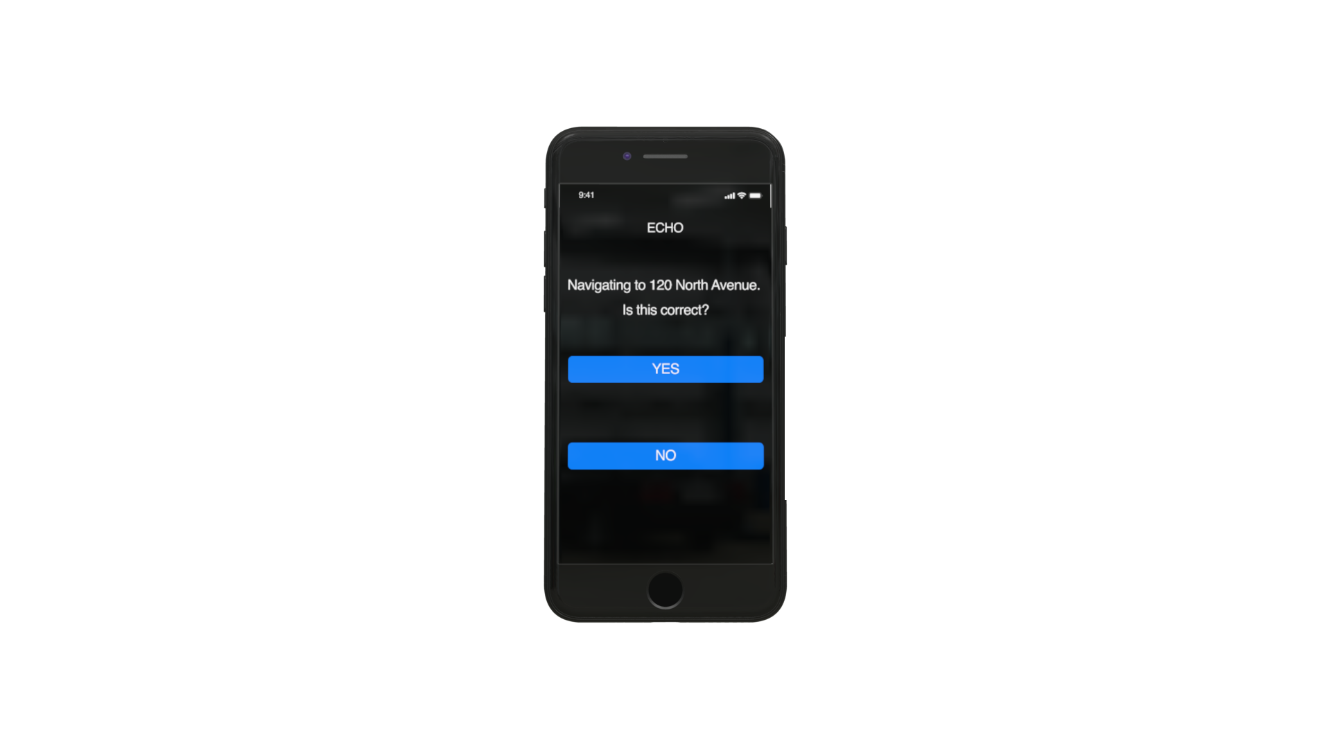
ECHO: “Navigating to 120 North Avenue. Is this correct? Say ‘yes’ or swipe left to proceed. Say ‘no’ to go back.”USER: “Yes”
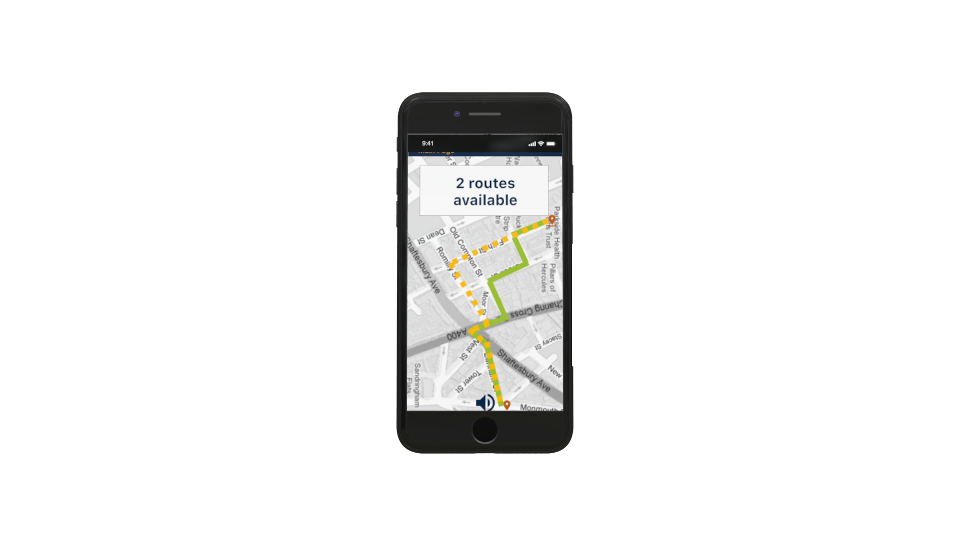
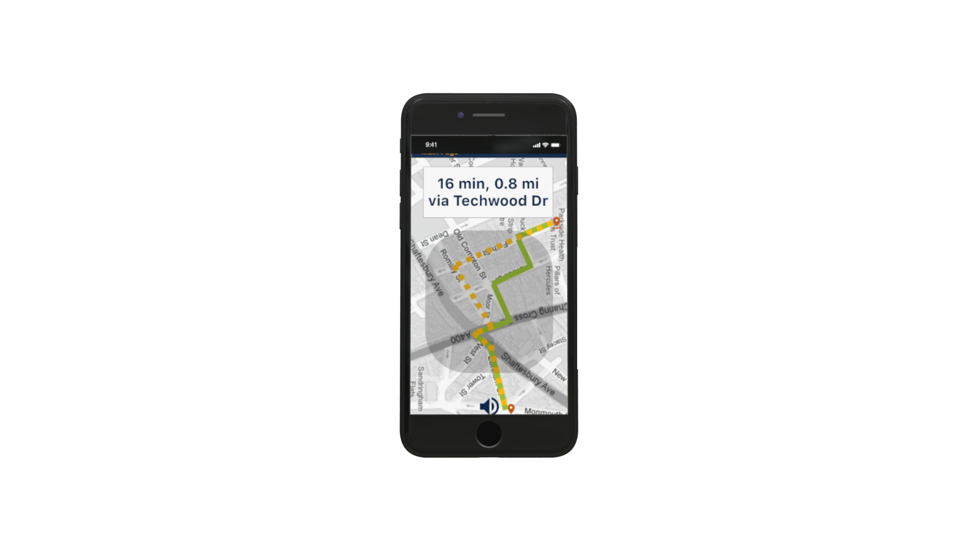
ECHO: “Route 1. 16 minutes, 0.8 miles via Techwood Drive. Say 'Next' or swipe left to hear other options, say 'Route 1' or swipe up to proceed with this option, or say 'no' to return to homepage.USER: “Route 1.”
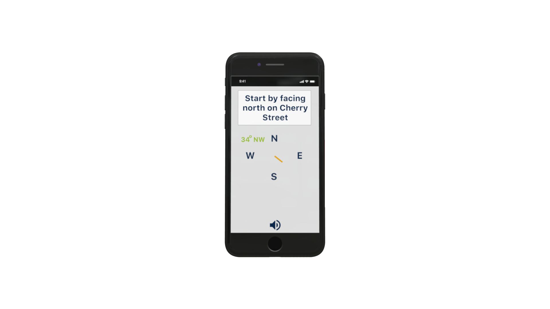
Haptic feedback allows visually impaired users to feel confident that they are heading in the right direction.
ECHO: “Turn slowly until phone buzzes in three short quick bursts. This will be your starting destination. Double tap to reset.
phase 4: user testing
User testing was performed using app mockups on notecards and simulating the steps from opening the app to confirming the final destination with a visually impaired user. Feedback included appreciation for the inclusion of potential obstacles on the route as well as the ability to utilize haptic touch. The recognition of this was important as feedback on existing applications included specific directions but for a wide range of locations. The advance notice of obstacles such as pedestrian crosswalks and staircases was important as it was a feature that was missing in other existing applications. The user interface design of the application included a color palette that provides high contrast, allowing user’s to distinguish between different parts of the screen. Testing showed that this color palette work as intended, however, some of the icons, such as the education or grocery icons, were hard to distinguish for some levels of visual impairment. Feedback showed that inability to distinguish those icons did not affect the overall usability of the application.
Human Factors Considerations
This app uses the principles of consistency and standards throughout each screen. In each screen, if voice diction is enabled, the user must press and hold the screen while speaking for their voice to be registered and subsequently interact with the app. Precision is not necessary when holding down the screen and intuitive forward and back swiping is included for a more accessible experience. Haptic touch allows the app to “talk back” to the user without actual speech, which can reassure the user that the app is listening when the user has started and finished speaking, as well as when the user is orienting themselves in the correct direction. The user can trust the app and feel secure that the app is navigating the user safely to their desired destination.
The colors on the main screens employ the Apple blue color against a black background as we researched that this is easily decipherable. For the navigation screens that involve more color to differentiate various logos, roads and text, we chose to use yellow on navy blue that we researched would always be decipherable in case of color blindness.
By providing the user with the ability to pin frequently visited locations, our app implements the principles of flexibility and efficiency of use. Although many users of current navigation apps for the visually impaired really liked or wanted a feature like this, it was a trade off because it made the homescreen of the app more complicated by adding another button. It also takes away from the streamlined usage of the app, as there are extra steps, and therefore extra buttons the user must navigate to in order to pin a location. However, this inclusion of pinned locations ultimately leads to a more effective interface because it lets users more quickly navigate to places they have saved, rather than having to remember an address in working memory.
Our app tells users points of interest (POIs) that they will pass on the way to their destination. This helps visually impaired users, most notably those that we interviewed, reaffirm that they are on the correct path because they can check for the landmarks they are supposed to pass. For blind users, this function serves merely to point out places of interest that they may want to stop at on the way to their destination, which they would have no other way of knowing was there. These POIs employ the human factors principles of error prevention, recognition, and recovery, by helping the user recognize errors if they do not pass the stated landmark.
The human factors principles of simplicity and aesthetic integrity are used in the pinned locations screen. Aesthetic integrity is implemented by using Google Material Design user-tested icons, and color-coding them for the visually impaired user to better make out. Simplicity is used by also adding the building title underneath each logo, so that the user doesn’t need to rely on color and logo alone, which could lead to an overload of working memory to recall which logo/color combination pertains to which pinned location.
All of the app pages use the principle of simplicity by having the minimum required amount of information necessary to convey the needed information to the user. No superfluous design was used, and this app is on the plainer side for ease of use so the user can use the principle of “see and touch” (or its equivalent), rather than “remember and type”, as one would have to do with a complicated interface. This is a tradeoff however, as the app may be perceived as “ugly” by sighted viewers or users due to its simplicity. However, we felt this to be a fair tradeoff as the target demographic is visually impaired/blind users.
Anticipated errors include external noise when navigating, which may interfere with voice operated aspects of the app. Alternatives to this would be including a “swipe up” feature to choose an option or to designate completion of a step. In future iterations, we would like to find a balance between simplifying the number of elements on the main screens while also incorporating a fast-track option, where a visually impaired user can select frequented locations more easily without needing to go through several screens to land on the saved places screen.